SPRING 2023
  • HOME
  • OTHER
  • GRFX-1413
  • GRFX-4503
  • GRFX-4803

Design Blog (2016)

Weekly posts. Most recent post will be at top of page.
Scroll to bottom of page to see all posts in this reverse chronological order.

The importance of consistency

11/18/2016

1 Comment

 
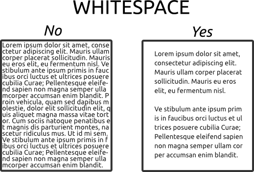
​"Consistency will make your design better, easier to use, and practically invisible. It gives the user plenty of room to experience the design in the way you intend.

Designing for consistency is a no-brainer in some cases and a little trickier to understand in others. Quite simply, consistency is the thread that ties together elements in a single design. It also ties together designs across a single campaign or brand, creating a product that is distinguishable, usable and effective." -1

Graphic elements: The graphics style and theme you choose should complement your design. Often referred to as the visual voice, the graphics should have a connection with one another. For example, you don’t want to mix and match hand-drawn, sketchy arrows with high-gloss, pixel-perfect stock icons. The graphics you choose should have a similar look and feel. - 2

Typography Size, Spacing and Position: Establish a basic style guide for your course to include heading, body, and caption fonts, and stick to those fonts for your entire design. Most of your pages/pieces within that design will have similar structures, so plan on defining your fonts at the start of each project. - 2

Colors: Select a harmonized palette at the beginning of your project and define the way each color will be used in your designs. See earlier post about color and see colourlovers.com.
Picture
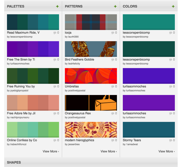
"To create a great color palette, pick a dominant color and use concepts of color theory to add a secondary color or two. Then jot down a quick set of style and usage rules for each color and how it will be used throughout the design. Stick to the rules and you have color consistency." - 1
Picture
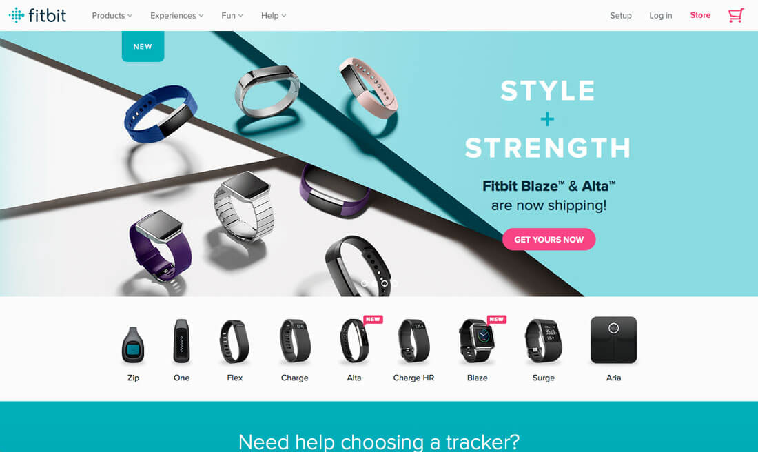
https://designshack.net/articles/graphics/7-tips-for-designing-consistency/

Space and How It Is Used: Just as important as the size of elements is the space between them. There’s nothing more distracting than a design where elements just seem dumped on the canvas with no organization or rules – some photos overlap while others might have plenty of space between them.

The best way to establish – and stick to – common spacing rules is by using a grid system. This set of invisible lines will help you determine where and how to place elements so that very single block, from text to buttons to images, falls into perfect harmony.

While you’re thinking about space, remember to check for consistent spacing both vertically and horizontally. This includes looking at the relationship between like elements and ones that are different. (It’s OK to have spacing rules for each.) - 1 & 2
Picture
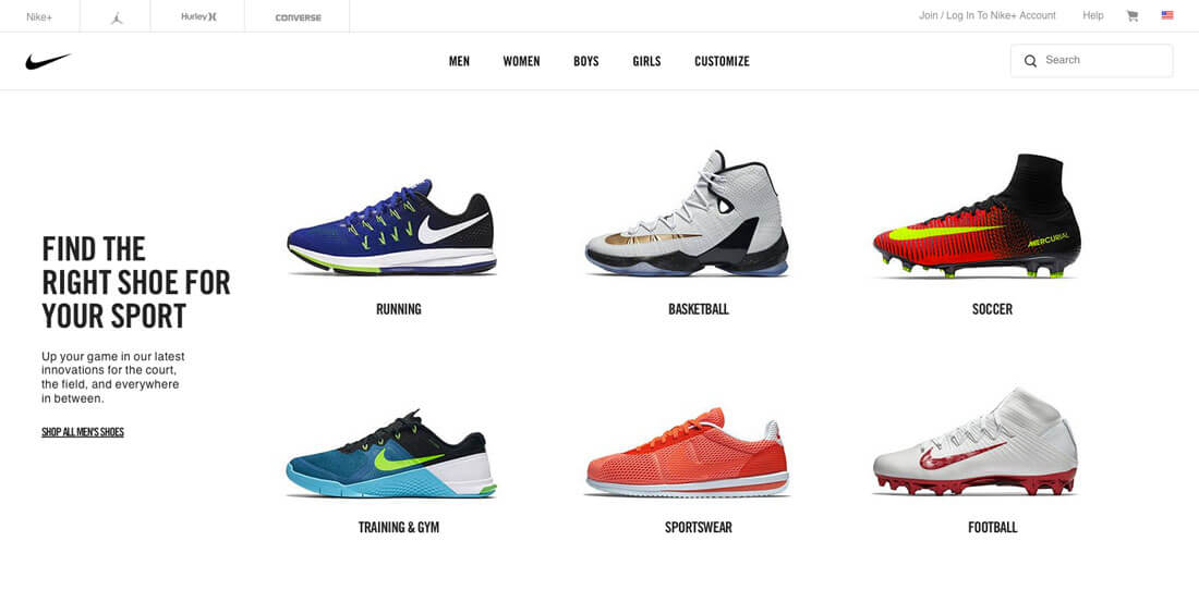
https://designshack.net/articles/graphics/7-tips-for-designing-consistency/

Visuals That Cross Mediums: "Brand visuals, such as images and illustrations, should carry across mediums. Whether you are designing a project for a website or brochure, billboard or social media, the visual identity of the brand should not change.

This often involves using a common photo set. Some brands have detailed rules for how visuals are used – from color overlays or watermarks on all images to a certain aspect ratio for all photos. Regardless of what you want your style to be, the important thing is to use is regardless of the location.

To do this most effectively, it is important to have a great visual deck packed with high quality, high resolution imagery that you can use and reuse." - 2
Picture
http://www.artvisiona.com/wp-content/themes/galerie_artvisiona/imagini_proiecte//2010/04/safina1.jpg
CONCLUSION
Design consistency creates the structure that users desire. It also creates a framework that users understand, contributing to overall usability and engagement.

It starts with a set of rules and style guide for each project. Even if you work alone, create a list of rules for how a project will use color, type, size, space, user interface elements and interactions. It will speed up the design process for you and lead to a better, more usable design.
All text quoted or paraphrased from the following:
1 - ​https://community.articulate.com/series/29/articles/3-essential-visual-design-concepts
2 - https://designshack.net/articles/graphics/7-tips-for-designing-consistency/

STUDENTS:
​No samples needed for this post. 

1 Comment

White Space

11/13/2016

4 Comments

 
"​When was the last time you actively considered the role of nothingness in your life? We generally focus on the tangible–however, a strong design requires careful attention to both what’s there and what isn’t there. White space (sometimes spelled “whitespace”) is integral because it tells our brains which elements in the design are the most important–it helps us process these elements, both on their own and as part of the overall image." [White space is related to positive vs. negative space, which was discussed in earlier Blog post. In class, I also continually remind you about awareness of space vs. shape.]
Picture
https://5thcolor.files.wordpress.com/2011/09/white-space.jpg

"Active and Passive White Space 
White space refers to the canvas space left in between different elements of your design. You may have also heard it referred to as negative space. It’s important because it keeps your design from being too cluttered or too confusing. There are two major types of white space in graphic design:

Active White Space – This is the space that you make a conscious effort to add to your design for emphasis and structure. Active white space is often asymmetrical, which makes the design look more dynamic and active.

Passive White Space – This is the white space that occurs naturally, such as the area between words on a line or the space surrounding a logo or graphic element.

​When dealing with white space, you will mostly be concerned with the active white space—-however, you still have to pay attention to your passive white space and how it works with your overall design."
BELOW:
​The image on the left has horrible command of white space, both active and passive. The image on the right gives much better awareness of white space, both active and passive. . 
Picture
http://static1.squarespace.com/static/54ff45f0e4b0b7c9466ccf64/550766dde4b0ba69bba7d554/55076753e4b0761a0eead3e3/1426548566189/female_spread.jpg?format=1000w
BELOW:
The image below concentrates on passive white space. See how the left seems uncomfortably crowded and isn't welcoming to the reader. The image on the right is much better and this is achieved simply by adding more leading. 
Picture
http://milq.github.io/white-space/white-space.png
BELOW:
​Consider the passive and active white space. 
Picture
https://assets.econsultancy.com/public/imgur/C27rBY1.jpg

"It’s not always white. Don’t let the name fool you; white space can be any color or pattern you like.
The term “white space” is actually a bit of a misnomer because it implies that the space has to be white in color. White space can actually be any color that represents the negative space in your design. For example, a presentation folder might use a bright hue like yellow in place of white to bring energy and color to the design. White space can even have a repeating pattern (like a subtle texture) to make it more visually appealing. Colored whitespace is more interesting to look at than plain white, but the principles are still the same—it’s an area that you don’t want the eye to focus on."

In the following examples, the (active) white space is actually green in the Apple ad, blue-gray texture in The Pianist poster, and bright cyan for the last poster about a book festival. 
Picture
http://opusdesign.us/wp-content/uploads/2012/10/apple-ad.jpg
Picture
https://s-media-cache-ak0.pinimg.com/236x/27/43/a6/2743a605621730f3e2705133a8ca9bd1.jpg
Picture
http://wix-wpblog1-wix-com.s3.amazonaws.com/blog/wp-content/uploads/2014/02/07112213/vectors-01.jpg

​"Conclusion
Whatever you do, don’t fall into the trap of thinking of white space as “empty space.” It may look empty, but that’s because you designed the space to give viewers a better look at your design, not because you didn’t have anything better to put there. When it comes to graphic design, the elements you leave out are just as important as the ones you create."
- All text from http://www.printwand.com/blog/white-space-in-graphic-design-and-why-its-important
Picture
http://static1.squarespace.com/static/54ff45f0e4b0b7c9466ccf64/550766dde4b0ba69bba7d554/55076753e4b0761a0eead3e3/1426548566189/female_spread.jpg?format=1000w

STUDENTS:
One sample of a print PAGE LAYOUT. Not just a logo, but a magazine page or spread, poster, billboard, etc. 
THEN explain where and how the white space is used. Consider Passive and Active white space. And remember white space doesn't mean it's the color white. 

4 Comments

FILE PREP CHECKLIST

11/7/2016

0 Comments

 
​​After you've gone through rounds of revisions on the computer, PRE-PRESS FILE PREP is the next step.  Preparing a digital file to go to press, whether that be OfficeMax or (more importantly!) an offset press, is an important step in the process.  If not executed properly, unnecessary costs and missed deadlines occur.   

Even designers who have done this many times often use a File Prep Checklist to double-check all steps have been taken. Though things like correct color modes and DPI come naturally via experience, pre-press is a final step that must be respected.  

Please see the following links to informative sites or PDFs that are a good start to creating your own checklist. Students who are in ART-2413 Typography will become more familiar with pre-press file prep in ART-2423 Print & Publication Design.
READ THIS PAGE: FILE PREPARATION TIPS
DOWNLOAD THIS PDF AND KEEP IN SKETCHBOOK

​NO SAMPLES; HOWEVER, STUDENTS SHOULD PRINT THE PDF AND ADHERE IN THEIR SKETCHBOOK. 

0 Comments

The Exposure Effect/Consistency

10/28/2016

2 Comments

 
The Exposure Effect states that repeated exposure to stimuli for which people have neutral feelings will increase the likeability of the stimuli. (Also known as mere exposure effect, repetition-validity effect, frequency-validation effect, truth effect, and repetition effect.) For example, the more a song or slogan is repeated, the more popular it is likely to become. The strongest exposure effects are seen with icons, people, and auditory stimuli. The exposure effect gradually weakens as the number of presentations increases. The exposure effect only applies to things which have a neutral or positive association, as things with a negative association repeated will often amplify negative perception. 

Familiarity plays an important role in aesthetic appeal and acceptance. People like things more when frequently exposed to them.  For example, initial exposure to Gustave Eiffel with the Eifffel Tower (first image below), Picasso with his Cubist works (second image), and Frank Lloyd Wright's Guggenheim Museum (third image) were all met with great resistance. However, now all three are widely accepted as brilliant and beautiful because familiarity with the work increased and resulted in greater popularity and acceptance.
Picture
http://wordlesstech.com/wp-content/uploads/2012/02/Building-the-Eiffel-Tower.jpg
Picture
http://echostains.files.wordpress.com/2009/10/picasso-avignon-reduce.jpg
Picture
http://www.newyorker.com/images/2009/05/25/p465/090525_r18486b_p465.jpg
​​The exposure effect has always been a primary tool of politicians.  Ubiquitous positive depictions increase the likability and support of political leaders.  Imagine if my Google search for images of President Obama produced multiple images of a confused or angry leader! In fact, consider what is happening during our 2016 elections, specifically the media’s portrayal of candidates and how repetition has affected this. 
Picture
all images from Google Search: President Obama; 28 Oct 16
​Of course advertising, design, and marketing use the exposure effect constantly.  This is where consistency is also important.  When something is different from the repeated exposure, the effect is nullified.  See the logos below, all of which have gained significant brand equity even to the point of lifestyle identification being intertwined with a brand's persona.  Though the logos have changed over the years, there have rarely been significant shifts without consequence.  
Picture
http://www.demilked.com/magazine/wp-content/uploads/2012/03/famous-logos-past-future-thumb640.jpg
Beyond logos, advertising can use the exposure effect to enhance perceived credibility and generally enhance the way people think and feel about a message or a product.  This can be done with everything from a logo to an entire campaign including advertising, social media, and collateral.
​-all text above paraphrased from Universal Principles of Design; Lidwell, Holden, Butler

​​STUDENTS: NO SAMPLES THIS WEEK. 

2 Comments

Gestalt Principle of CLOSURE

10/23/2016

3 Comments

 
​Another principle of Gestalt is CLOSURE. For closure, the mind supplies the missing pieces to "close" a form, composition, etc. 
In the image below, ​there is no actual lightbulb. The mind wants to close the shape formed by the hand while the hardware at the bottom aids in the suggestion of "lightbulb". 
Picture
http://gdj.gdj.netdna-cdn.com/wp-content/uploads/2013/05/Gestalt-Closure.jpg
​The next well-known logo for World Wildlife Federation uses closure to create a panda bear. 
Picture
http://media.creativebloq.futurecdn.net/sites/creativebloq.com/files/images/2013/10/image04.jpg
The following are part of a designer's "Gestalphabet" where he uses human behaviorism to "close" the open forms in order to create a recognizable image. The viewer then sees A, B, C, and D when he has not actually used any of these letterforms. 
Picture
https://wordsarepictures.files.wordpress.com/2010/04/picture-31.png
Closure is often used in logos. The S in USA is formed by closure. The girls' faces in the Girl Scouts are formed by closure and Figure-Ground. 
Picture
http://sites.psu.edu/psych256fa14/wp-content/uploads/sites/14682/2014/09/usa-network.gif
Picture
https://journalism273.files.wordpress.com/2013/03/gslogo.gif?w=300&h=270

STUDENTS:
Find one sample that demonstrates Closure.

Use a photograph, painting, logo, or layout. Do not use one of the simple black diagrams that usually come up for Gestalt.  
3 Comments

Gestalt Law of COMMON FATE vs. CONTINUITY

10/16/2016

4 Comments

 
"The Gestalt LAW OF COMMON FATE states that humans perceive visual elements that move in the same speed and/or direction as parts of a single stimulus. A common example of this is a flock of birds. When several birds fly in the same direction, we normally assume that they belong to a single group. Birds that fly in a different direction do not appear to be included in the said group. A marching band is another example that usually exhibits the gestalt law of common fate. Below is yet another example showing this principle [as the bubbles are grouped together in their movement off the page]."  
​-- https://explorable.com/gestalt-laws-form-continuation-common-fate
Picture
http://www.adorama.com/alc_images/article13706_3.jpg
​Common Fate is often confused with Gestalt's Principle of Continuity. Common Fate is more about suggested movement while Continuity is about resting objects that are not continuing dynamic movement. 
​
"The principle of good continuity holds that humans tend to perceive each of two or more objects as different, singular, and uninterrupted object even when they intersect. In other words, individuals tend to group together as well as organize curves, lines and other forms that are found in similar directions. However, those that establish changes in direction may be perceived as different objects. The alignment of the objects or forms plays a major role for this principle to take effect. This principle is well used by educators in teaching young kids on how to write the letters of the alphabet as well as draw images. Below is an example showing the Gestalt law of good continuity [as you follow and connect the lines in the pattern though they don't actually connect."
​-- https://explorable.com/gestalt-laws-form-continuation-common-fate
Picture
http://www.barbaradelong.com/wp-content/uploads/2013/11/08162.jpg
​Below is the iconic album cover for The Beatles Abbey Road. This shows both Common Fate and Continuity. The 4 band members walking the same direction shows Common Fate. (Consider what would happen if one were walking the other way. This would be using the Law of Common Fate via violation of it.) The law of Continuity is used on the smaller broken white lines in the middle of the street (not the crosswalk). We continue those as one line. It is easy to confuse the Law of Common Fate and Continuity. But in this case, the 4 band members are only Law of Common Fate while the lines in the street could be argued to show both.
Picture
http://cookusart.com/images/1/beatles-abbey-road/beatles-abbey-road-05.jpg

​STUDENTS:
​ONE SAMPLE OF GESTALT COMMON FATE

​Find a sample that demonstrates Common Fate. Use a photograph, painting, logo, or layout. Do not use one of the simple black diagrams that usually come up for Gestalt - push yourself further than this.  Also be careful that your sample does not show Continuity instead of Common Fate; however, you can explain if it shows both Common Fate AND Continuity.
4 Comments

Color Theory

10/9/2016

4 Comments

 
Color theory encompasses a multitude of definitions, concepts and design applications - enough to fill several encyclopedias. However, there are three basic categories of color theory that are logical and useful : The color wheel, color harmony, and the context of how colors are used.
Color theories create a logical structure for color. For example, if we have an assortment of fruits and vegetables, we can organize them by color and place them on a circle that shows the colors in relation to each other.
Students should be familiar with all of the following via Design 1 and Painting specifically.
Nothing teaches a designer about color better than learning how to paint! Mixing pigment and utilizing how colors affect each other on canvas are both important skills you will continue to use in design.

COLOR WHEELS
A color circle, based on red, yellow and blue, is traditional in the field of art. Sir Isaac Newton developed the first circular diagram of colors in 1666. Since then, scientists and artists have studied and designed numerous variations of this concept. Differences of opinion about the validity of one format over another continue to provoke debate. In reality, any color circle or color wheel which presents a logically arranged sequence of pure hues has merit.
Picture
​There are also definitions (or categories) of colors based on the color wheel. 
Primary Colors: Red, yellow and blue
In traditional color theory (used in paint and pigments), primary colors are the 3 pigment colors that can not be mixed or formed by any combination of other colors. All other colors are derived from these 3 hues. 
Secondary Colors: Green, orange and purple
These are the colors formed by mixing the primary colors.
Tertiary Colors: Yellow-orange, red-orange, red-purple, blue-purple, blue-green & yellow-green
These are the colors formed by mixing a primary and a secondary color. That's why the hue is a two word name, such as blue-green, red-violet, and yellow-orange.

COLOR HARMONY
Harmony can be defined as a pleasing arrangement of parts, whether it be music, poetry, color, or even an ice cream sundae.

In visual experiences, harmony is something that is pleasing to the eye. It engages the viewer and it creates an inner sense of order, a balance in the visual experience. When something is not harmonious, it's either boring or chaotic. At one extreme is a visual experience that is so bland that the viewer is not engaged. The human brain will reject under-stimulating information. At the other extreme is a visual experience that is so overdone, so chaotic that the viewer can't stand to look at it. The human brain rejects what it can not organize, what it can not understand. The visual task requires that we present a logical structure. Color harmony delivers visual interest and a sense of order.

In summary, extreme unity leads to under-stimulation, extreme complexity leads to over-stimulation. Harmony is a dynamic equilibrium.
Some Formulas for Color Theory
​There are many theories for harmony. The following illustrations and descriptions present some basic formulas.
Picture
1. A color scheme based on analogous colors: Analogous colors are any three colors which are side by side on a 12 part color wheel, such as yellow-green, yellow, and yellow-orange. Usually one of the three colors predominates.
Picture
2. A color scheme based on complementary colors: Complementary colors are any two colors which are directly opposite each other, such as red and green and red-purple and yellow-green. In the illustration above, there are several variations of yellow-green in the leaves and several variations of red-purple in the orchid. These opposing colors create maximum contrast and maximum stability.

COLOR CONTEXT
How color behaves in relation to other colors and shapes is a complex area of color theory. Compare the contrast effects of different color backgrounds for the same red square.
Picture
​Red appears more brilliant against a black background and somewhat duller against the white background. In contrast with orange, the red appears lifeless; in contrast with blue-green, it exhibits brilliance. Notice that the red square appears larger on black than on other background colors.
Different Readings of the Same Color
Picture
If your computer has sufficient color stability and gamma correction, you will see that the small purple rectangle on the left appears to have a red-purple tinge when compared to the small purple rectangle on the right. They are both the same color as seen in the illustration below. This demonstrates how three colors can be perceived as four colors.
Picture
​Observing the effects colors have on each other is the starting point for understanding the relativity of color. The relationship of values, saturations and the warmth or coolness of respective hues can cause noticeable differences in our perception of color.
All of the above from http://www.colormatters.com/color-and-design/basic-color-theory

COLOR SYMBOLISM
There are pages of information out there about color symbolism, especially in regards to logos and other visual elements speaking to a target market. However, one must have CULTURAL AWARENESS in the 21st century. Some colors - especially red, white, and black - have extremely different meanings between cultures (and subcultures). Depending on the education level of the target, a person in another culture (or subculture) could be fine with having - or even want - mainstream American symbolism pushed upon them; however, wouldn't it be better to instead embrace diversity and find a better answer?

EXPLORE COLOR PALETTES AND TRENDS
COLORLOVERS

STUDENTS:
Find one image (painting, photography, design layout, logo, etc.) that uses either Analogous or Complementary Color. Post the image, write if it uses Analogous or Complementary, and explain which colors are used. 

4 Comments

Symmetrical and Asymmetrical Balance

10/2/2016

12 Comments

 
​Balance in design is important. Designers must balance things like unity vs. variety and figure vs. ground. Balance can also be described as achieving visual equilibrium via symmetrical and asymmetrical balance. To do this, designers find balance by choosing what is where in a composition.

Symmetrical and/or asymmetrical balance are as important in painting and photography as they are in a typographic layout. It is imperative that designers understand the pleasing visual of balance while also controlling the visual hierarchy in a dynamic layout. 
Picture
http://images.slideplayer.com/19/5785153/slides/slide_28.jpg

SYMMETRICAL BALANCE
"Symmetrical balance is also called formal balance because a form (formula) is used. This formula is the usage of a mirror image about a vertical (or horizontal) axis. The results look formal, organized and orderly. There is a strong emphasis on the center axis in symmetry since all of the information is reflected from this point...Symmetrical images have a strong sense of unity because at least half of the image is repeated. At the same time they lack variety because only half is unique.​"
Picture
http://4.bp.blogspot.com/_fY54okBt12U/TN3UPTrywSI/AAAAAAAACdE/vQ-5OctYWDE/s1600/symmetry+-asymmetry+ex.jpg

ASYMMETRICAL BALANCE
"Asymmetry means without symmetry. That by itself has nothing to do with balance. It just means that there are no mirror images in a composition. The term, however, is usually used to describe a kind of balance that does not rely on symmetry: asymmetrical balance.

There is no simple formula for achieving balance in asymmetrical balance (hence the term informal balance) so the designer must sense whether or not the composition is balanced. The composition either looks like it is balanced or it does not. Where does your attention go when you look at an image? If it seems to wander around more or less evenly, there is probably balance. If you seem to always come back to the same area before looking elsewhere, then the balance is suspect."
Picture
http://4.bp.blogspot.com/_fY54okBt12U/TN3UPTrywSI/AAAAAAAACdE/vQ-5OctYWDE/s1600/symmetry+-asymmetry+ex.jpg
Picture
http://images.slideplayer.com/28/9312741/slides/slide_16.jpg
Text paraphrased from http://daphne.palomar.edu/design/bsymm.html
Consider the asymmetrical balance shown in the Power of Thirds image from a couple of weeks ago or in a page layout regarding Grid Theory from last week. 
Picture
Picture

STUDENTS:
​ONE SAMPLE EACH OF SYMMETRICAL AND ASYMMETRICAL BALANCE

  1. Please post once with a website address displaying symmetrical balance and explain how the sample displays this.  ​
  2. Then post again with a website address displaying asymmetrical balance and explain how the sample displays this. 
​The two do NOT need to be related like the two images above.
12 Comments

Introduction to Grid Theory

9/25/2016

2 Comments

 
"Grids are like the invisible glue that holds a design together, so whether you work in print or on the web you need to understand grid theory…While some designers actively eschew grids in favor of a more intuitive, free-form layout, the most successful do so having worked with grids for years - they understand the rules before they break them.

01. Grids establish a meter and rhythm
The foremost purpose of a grid, in graphic design at least, is to establish a set of guidelines for how elements should be positioned within a layout. Not only does an effective grid provide the rhythm for a design, but it also defines the meter.

The rhythm and meter of a layout is an important part of making the content accessible, helping the viewer to understand where to find the next piece of information within the layout. It sets expectations and defines the rules, timbre and - in some cases - voice of the design. Think of a grid as providing the road-map along which your viewers travel.
Picture
02. Grids define and reflect proportion
A key aspect of the grid is its ability to help determine and define proportion. In print, proportions most commonly echo the size of the media; the shape and orientation of the paper are often reflected in the size and shape of images included within a layout, for example. This feels comfortable because the reader subliminally understands the context of the layout as a result of the physical shape and size of the delivery mechanism (in this case, a piece of paper!).  [The “art words” to use here would be visual hierarchy and understanding the read of the page at its most basic is where the weight of the page is per script of the language. Visual hierarchy is what is read first, then second, then third, etc. The read of the page for English script (the Latin alphabet used to write the English language) is top left to bottom right. 

03. Grids, the rule of thirds, and the golden ratio
The golden ratio (also known as the golden mean) determines the most pleasing set of proportions for an element, and is simplified to the 'rule of thirds'. When used in combination with a grid, these simple rules for size, position and proportion can help ensure a layout feels both coherent within itself, but also appealing aesthetically. Why would you want to appeal in these terms? Because by doing so, you're making the content more accessible to the reader. Remember that a grid is the invisible glue behind content - in most cases it should be transparent to the viewer.
Picture
  • Above is a screen shot from last week's post about the Rule of Thirds.
  • Golden Ratio (also called Golden Mean or Fibonacci's Sequence) shown below. 
Picture
04. Grids provide a foundation and balance
As we've seen, grids exist primarily to help determine the position and balance for a layout. This can be used to help ensure that content is presented in an easy-to-understand order, but conversely by providing a firm foundation a grid can also be used to highlight specific areas of content simply by breaking elements outside the grid. The viewer will naturally identify these break-outs and be drawn towards them, giving the designer the opportunity to play with the hierarchy of a layout and tweak the semantic meaning of a piece of work. -from http://www.creativebloq.com/web-design/grid-theory-41411345. 

  • Something to take away from grids no matter what is TO LINE THINGS UP. Use your guides, at least. Don’t just “eyeball” your layouts and things look sorta close. Really line things up.
  • The next level to take away from grids is how to organize information so that it is pleasing to the reader while being dynamic and engaging. 

​Here are examples of basic vertical layout grids.
1 column vertical grid
Picture
2 column vertical grid
Picture
Picture
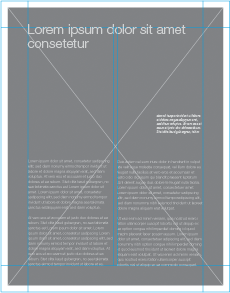
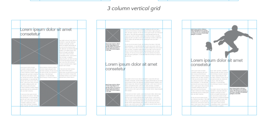
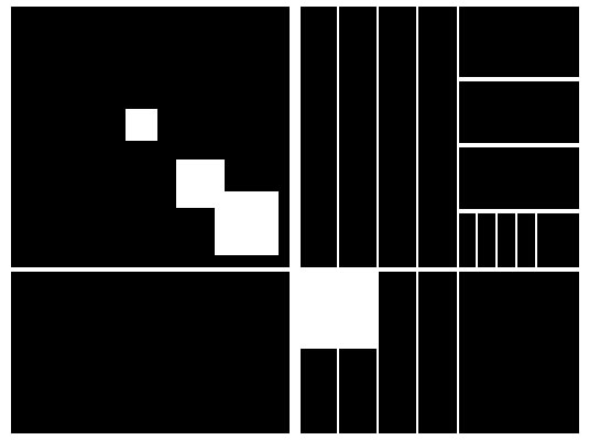
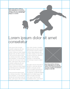
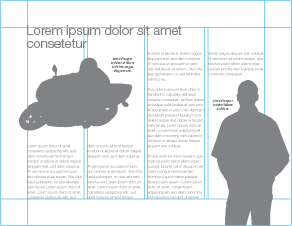
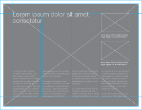
3 column vertical grid
Picture
Picture
Picture

Here are examples of basic landscape (horizontal) layout grids.
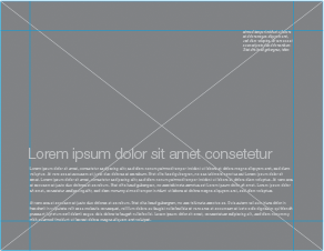
1 column horizontal grid
Picture
2 column horizontal grid
Picture
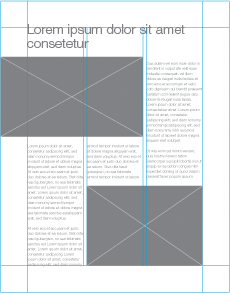
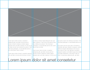
3 column horizontal grid
Picture
Picture
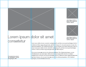
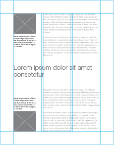
4 column horizontal grid
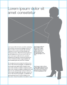
Picture
Picture
All images above from ​http://www.designersinsights.com/designer-resources/using-layout-grids-effectively

Students: There are no samples required this week.

​ART-2413 Typography students will have projects that specifically cover the grid. All other students should be aware of Grid Theory.

​Please research more or ask me for information if you need it.  

2 Comments

Rule of Thirds (a.k.a. The Power of Thirds)

9/17/2016

7 Comments

 
Picture
Picture
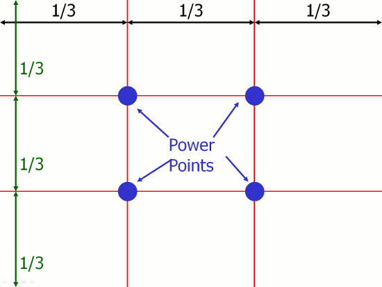
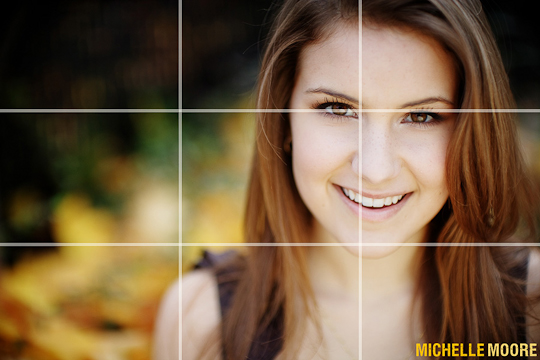
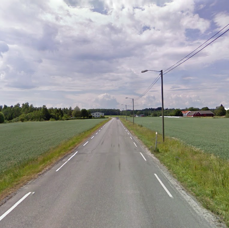
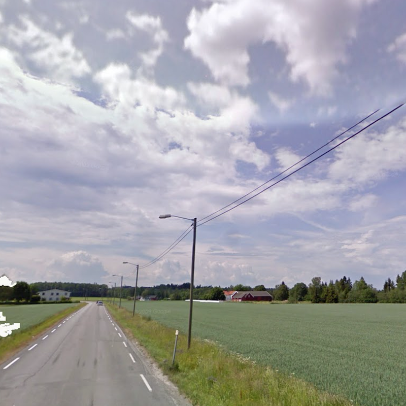
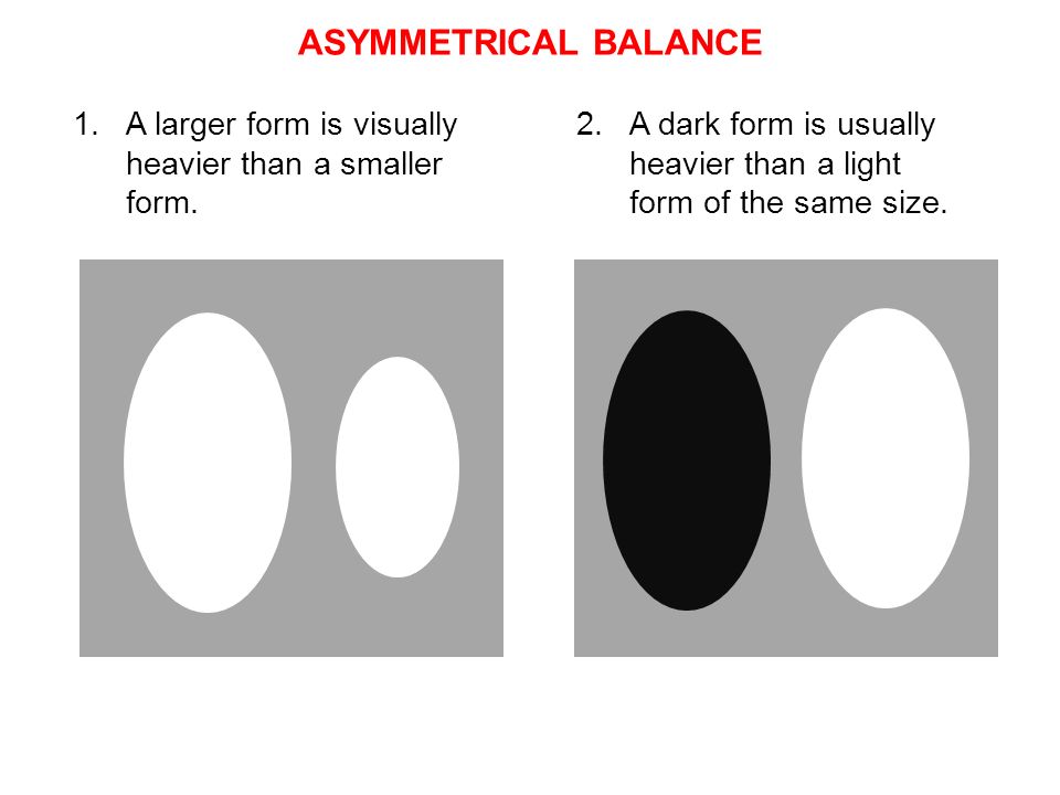
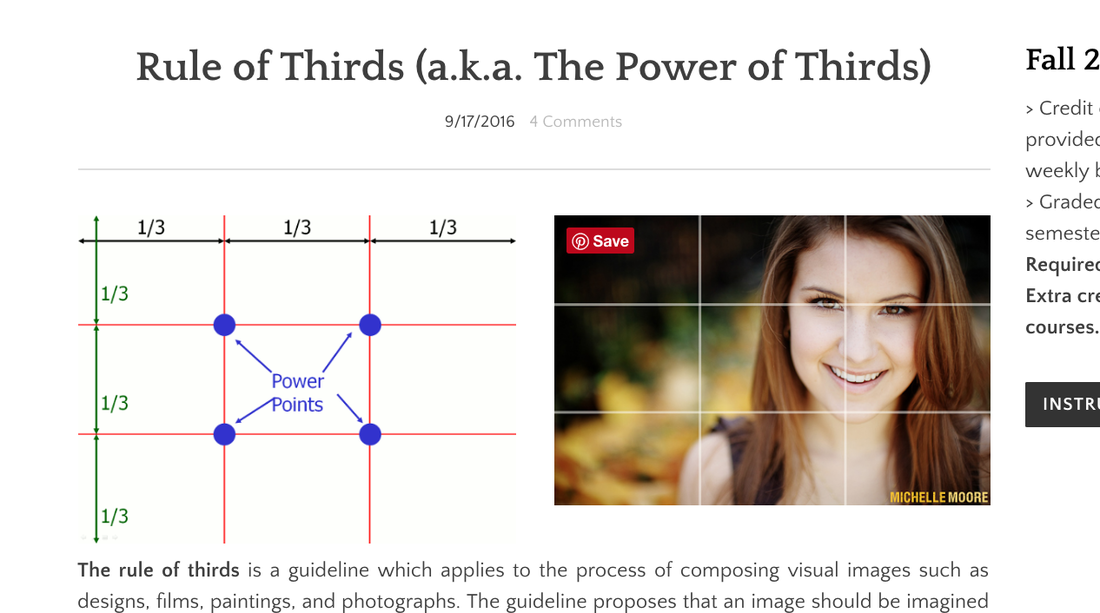
The rule of thirds is a guideline which applies to the process of composing visual images such as designs, films, paintings, and photographs. The guideline proposes that an image should be imagined as divided into nine equal parts by two equally-spaced horizontal lines and two equally-spaced vertical lines, and that important compositional elements should be placed along these lines or their intersections.  Proponents of the technique claim that aligning a subject with these points creates more tension, energy and interest in the composition than simply centering the subject would.  
-text from: http://en.wikipedia.org/wiki/Rule_of_thirds
images above: http://sixminutes.dlugan.com/wp-content/uploads/2008/06/rule-of-thirds-grid.gif; https://hhsrop.files.wordpress.com/2014/09/thirds.jp

Picture
https://minorsmajor.files.wordpress.com/2009/07/ruleofthird2.jpg
Picture
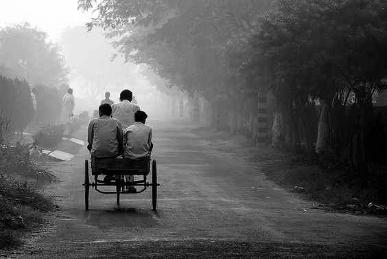
https://s-media-cache-ak0.pinimg.com/564x/00/51/e7/0051e7b8a0ea88004cca5616368622df.jpg
Picture
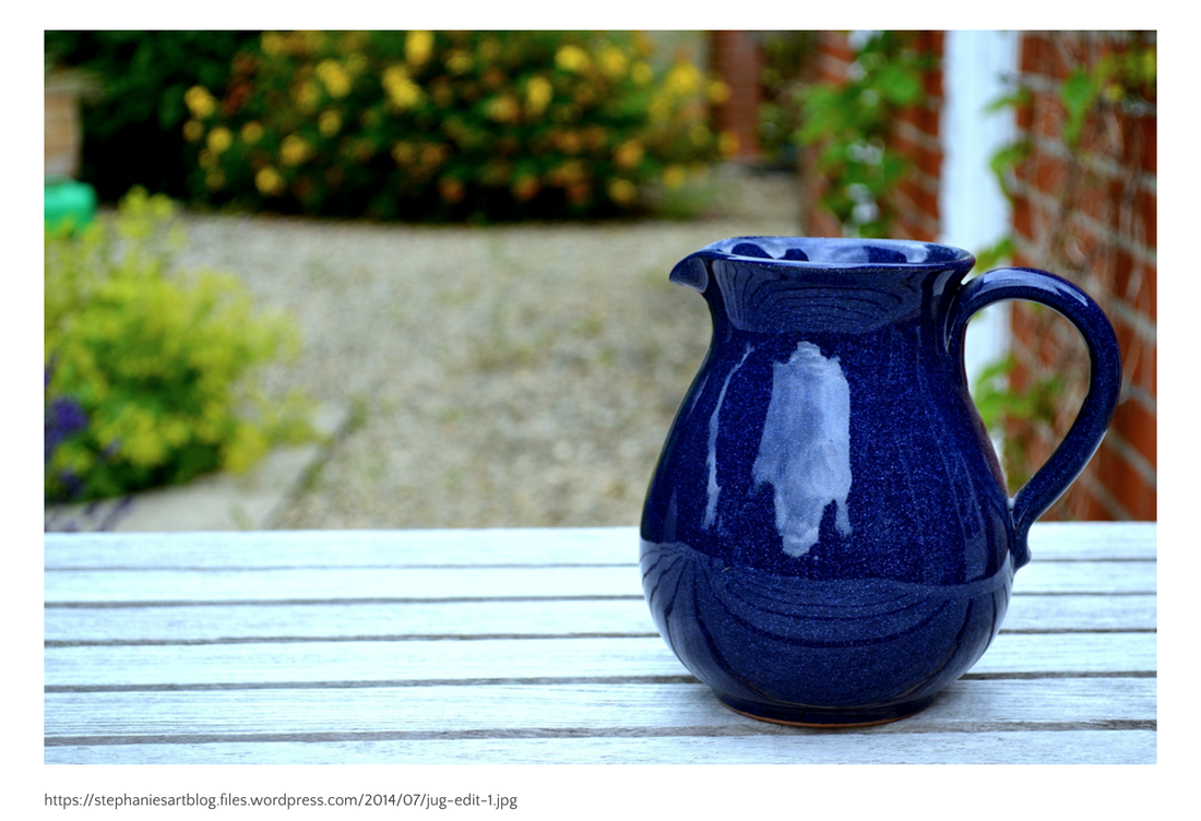
https://stephaniesartblog.files.wordpress.com/2014/07/jug-edit-1.jpg
Picture
http://www.creativeboom.com/uploads/articles/f2/f273cf12a5c274ec507b1c92ed1dd1f95454fe33_860.jpg
Picture
https://s-media-cache-ak0.pinimg.com/236x/8d/7c/a4/8d7ca42687b6c5bc2fdaa3fae5cb9ab9.jpg
Picture
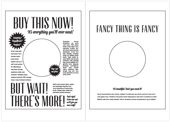
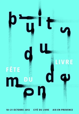
http://www.graphics.com/sites/default/files/socialposter1.jpg

STUDENTS:
​ONE SAMPLE OF AN IMAGE USING THE RULE OF THIRDS

Please post below with a website address displaying an image WITHOUT the Power of Thirds guidelines on top.  This image can include typography! Then explain how this sample displays the correct Power of Thirds.  
7 Comments
<<Previous

    Fall 2016

    > Credit only if sample provided for every weekly blog post.
    ​> Graded at end of the semester.
    Required for ART-2413. 

    Extra credit for all other courses.

    INSTRUCTIONS
  • HOME
  • OTHER
  • GRFX-1413
  • GRFX-4503
  • GRFX-4803